


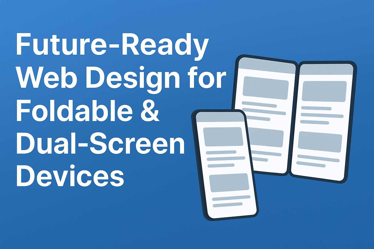
As technology evolves, foldable and dual-screen devices are no longer futuristic concepts—they’re part of the present. With devices like the Microsoft Surface Duo, Samsung Galaxy Z Fold, and other dual-display tablets, developers and designers must adapt to new ways of presenting content across dynamic screen states. This blog by top Indian website design companies explores how to design foldable & dual-screen Web Design for these devices, covering everything from detecting fold states to building seamless user experiences across multiple viewports.
📑 Table of Contents
- Understanding Foldable and Dual-Screen Device States
- Detecting Foldable Devices with CSS and JavaScript
- Using
horizontal-viewport-segmentsandvertical-viewport-segments - JavaScript:
window.visualViewport.segments - Device Posture API and Fold Detection
- Building Layouts with CSS Grid and Environment Variables
env(viewport-segment-width)andenv(viewport-segment-height)- Avoiding Content Overlap on Hinges
- Grid Placement for Dual-Screen Layouts
- Responsive Design for Folded and Unfolded States
- Media Queries for Folded vs. Unfolded Modes
- Flexible Grids with
minmax()andauto-fill - Orientation-Based Layout Adjustments
- Creating Seamless User Experiences Across Screens
- Synchronizing Content Between Viewports
- Handling Scroll Position and Input Fields
- Media Playback Continuity
- Testing and Browser Support for Foldable Features
- Surface Duo Emulation in Edge DevTools
- Chrome Flags for Experimental Features
- Polyfills for Visual Viewport API
- Designing for the Future
- Conclusion
- FAQs
1. Understanding Foldable and Dual-Screen Device States
Foldable and dual-screen devices can exist in multiple postures:
- Closed – Like a normal phone when folded.
- Flat/Unfolded – Creates a larger, tablet-like screen.
- Dual-Screen Mode – A visible hinge or bezel separates two displays.
- Tent Mode – Folded backward, often for presentations or media viewing.
Designing for these states means ensuring websites adapt dynamically, without breaking layouts.
2. Detecting Foldable Devices with CSS and JavaScript for Foldable & Dual-Screen Web Design
Web developers can detect foldable and dual-screen capabilities using CSS media queries and JavaScript APIs. These help determine whether a device has multiple viewports, hinges, or fold states.
3. Using horizontal-viewport-segments and vertical-viewport-segments for Foldable & Dual-Screen Web Design
CSS introduces media features for foldable devices:
@media (horizontal-viewport-segments: 2) {
  /* Device has two horizontal viewports */
  body {
    display: grid;
    grid-template-columns: 1fr 1fr;
  }
}
This allows developers to create responsive layouts that recognize multiple segments.
4. JavaScript: window.visualViewport.segments
The window.visualViewport.segments API helps developers detect viewport divisions programmatically.
if (window.visualViewport.segments) {
  window.visualViewport.segments.forEach(segment => {
    console.log(`Segment width: ${segment.width}, height: ${segment.height}`);
  });
}
This is powerful for dynamic adjustments in layouts and scripts.
5. Device Posture API and Fold Detection for Foldable & Dual-Screen Web Design
The Device Posture API provides information about hinge positions and fold states:
- Flat – One large screen
- Book Mode – Two side-by-side pages
- Tent Mode – Upright position
This enables developers to adjust experiences (e.g., dual-page reading in book mode).
6. Building Layouts with CSS Grid and Environment Variables
CSS Grid is ideal for dual-screen layouts. With environment variables, layouts can adapt to hinge spacing.
.grid-layout {
  display: grid;
  grid-template-columns: 1fr env(viewport-segment-width 1) 1fr;
}
7. env(viewport-segment-width) and env(viewport-segment-height)
These environment variables give precise measurements of each viewport segment.
env(viewport-segment-width)– Width of each screen segmentenv(viewport-segment-height)– Height of each screen segment
Developers can align UI elements without overlap across hinges.
8. Avoiding Content Overlap on Hinges for Foldable & Dual-Screen Web Design
One of the biggest challenges with foldables is avoiding content being hidden under a hinge. Designers must:
- Leave space around the hinge
- Avoid placing buttons or text where the fold occurs
- Use safe area insets with CSS environment variables
9. Grid Placement for Dual-Screen Layouts
Using grid-template-areas, developers can specify which content appears in each segment:
@media (horizontal-viewport-segments: 2) {
  .container {
    display: grid;
    grid-template-columns: 1fr 1fr;
    grid-template-areas: "content sidebar";
  }
}
This ensures intuitive layouts across segments.
10. Responsive Design for Folded and Unfolded States
Websites must adjust for both phone mode (folded) and tablet mode (unfolded). A flexible design approach ensures usability in both.
11. Media Queries for Folded vs. Unfolded Modes
Developers can use new media queries to detect folded states:
@media (spanning: single-fold-vertical) {
  /* Styles for vertical fold */
}
This enables adaptive layouts based on fold posture.
12. Flexible Grids with minmax() and auto-fill
Foldables require fluid grids. Using minmax() and auto-fill ensures elements adapt to available space.
.grid {
  display: grid;
  grid-template-columns: repeat(auto-fill, minmax(200px, 1fr));
}
13. Orientation-Based Layout Adjustments
Orientation changes (portrait vs. landscape) affect how dual-screens display content. Ensure layouts adjust gracefully using:
@media (orientation: landscape) { ... }
@media (orientation: portrait) { ... }
14. Creating Seamless User Experiences Across Screens
The key to foldable design is continuity:
- No sudden breaks when unfolding
- Maintain state across screen changes
- Avoid confusing UI transitions
15. Synchronizing Content Between Viewports
Dual-screen apps must ensure content remains synchronized:
- Shared scroll positions
- Linked navigation menus
- Consistent state management
16. Handling Scroll Position and Input Fields
When a device unfolds, scroll positions and input states must persist. This ensures users don’t lose progress when switching orientations.
17. Media Playback Continuity
If a user is watching a video or listening to audio, playback should continue seamlessly across folded and unfolded states. Developers can manage this with Media Session API.
18. Testing and Browser Support for Foldable Features
Not all browsers support foldable features yet, so testing is crucial.
19. Surface Duo Emulation in Edge DevTools
Microsoft Edge DevTools offers Surface Duo emulation, allowing developers to preview dual-screen layouts in the browser.
20. Chrome Flags for Experimental Features for Foldable & Dual-Screen Web Design
In Chrome, enabling flags like chrome://flags/#enable-foldable-experiment allows developers to test experimental APIs.
21. Polyfills for Visual Viewport API
Until support becomes mainstream, developers can use polyfills for window.visualViewport.segments and related APIs to ensure compatibility. Read: Dark Mode UI/UX Design: Pro Tips for Stunning Interfaces
22. Designing for the Future for Foldable & Dual-Screen Web Design
Foldable and dual-screen devices are shaping the future of responsive design. Websites must be:
- Flexible – adapting to new screen modes
- User-centric – avoiding breakpoints at hinges
- Forward-compatible – ready for evolving APIs and hardware
23. Conclusion
Designing for foldable and dual-screen devices isn’t just about responsive layouts—it’s about delivering continuous, intuitive experiences. By leveraging CSS Grid, environment variables, media queries, and new APIs, developers can build future-ready websites that shine on any device. Consult with a low-cost Kolkata based web design agency
24. FAQs – Foldable & Dual-Screen Web Design
Q1. What are foldable device media queries?
They are CSS rules like spanning: single-fold-vertical that detect folded vs. unfolded states for responsive layouts.
Q2. How do I avoid content being hidden under the hinge?
Use environment variables like env(viewport-segment-width) and grid layouts to ensure safe placement of UI elements.
Q3. Do all browsers support foldable device APIs?
Not yet. Microsoft Edge and Chrome Canary support some features, but polyfills may be needed for broader compatibility.
Q4. Can I test dual-screen layouts without owning a device?
Yes. Use Surface Duo emulation in Edge DevTools or Chrome’s experimental flags.
Q5. Why is continuity important in foldable UX design?
Continuity ensures media, input, and scroll states persist across folded and unfolded modes, creating a smooth user experience.
About Us – Bhavitra Technologies
At Bhavitra Technologies, we are a trusted IT company dedicated to delivering cutting-edge digital solutions for businesses of all sizes. If you’re searching for a low-cost web developer near me, our team of experts ensures professional, customized, and SEO-friendly websites tailored to your needs. With years of experience in web development, software solutions, and digital marketing, we help brands grow and succeed online. Our mission is to blend creativity with technology to provide user-friendly, scalable, and future-ready solutions. Choose Bhavitra Technologies, top ReactJS development service in India as your reliable partner for innovation, quality, and long-term success.